Restyling Yahoo! Mail Beta
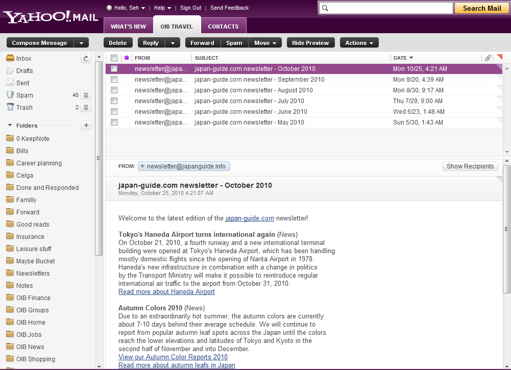
Yahoo! Mail just launched a beta for their latest user interface, which looks like the screenshot above. I have to say that I kind of liked the new skin but the heading just looks awful in my opinion: it’s too large, too loud and, honestly, pretty useless. With such a loud purple and a lot of whitespace, they are a complete distraction and annoyance when I’m reading emails.
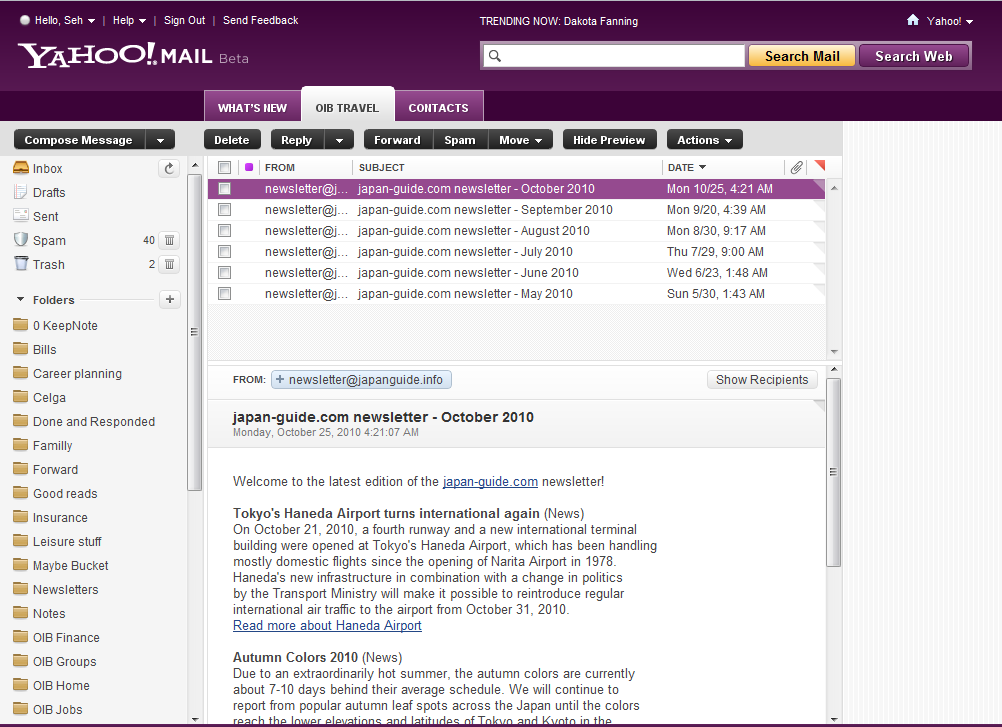
So I took matters in my own hands and made some restyling tweaks to really make the heading compact, and the result were way better than what Yahoo does (in my own biased opinion :-)):

I took away the Beta badge, latest trending topic, the button to Yahoo’s homepage and the Search Web button as they didn’t really serve any utility to me and …
Continue Reading (178 words, 1 minute read)Drawing Mockups with Adobe Ideas – Free 22 x 22px Grid Paper for iPad
What better tool to do iPad application mockups than using the iPad itself? Drawing out mockups using the PC/Mac always seemed awkward to me as I have to second guess the physical dimensions of each UI elements that I have drawn on-screen due to the different pixel densities between our monitor and the iPad.
With free drawing tools like Adobe Ideas on the iPad, I could draw out the UI elements and know exactly how large it’d look physically. The only problem is that… you start with a completely blank screen. Knowing the best practice of having UI elements with 44 x 44px height, a grid background would certainly be helpful in sketching things out.
I have created a set of three PNGs having a 22 x 22px grid that you can import …
Continue Reading (301 words, 2 minute read)