Restyling Yahoo! Mail Beta
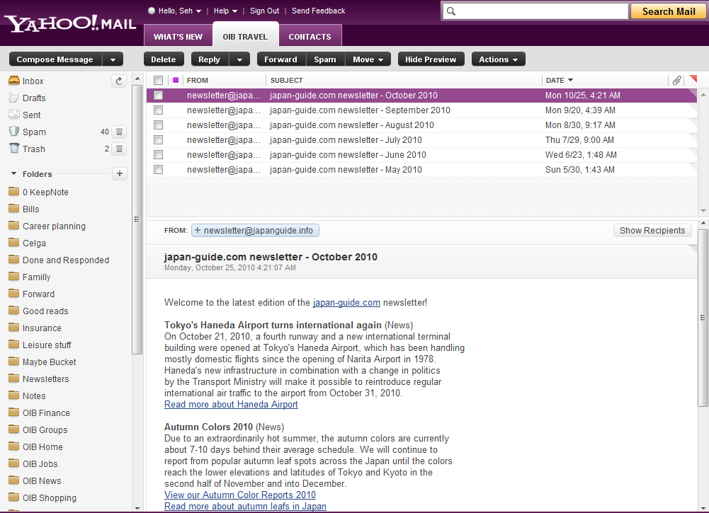
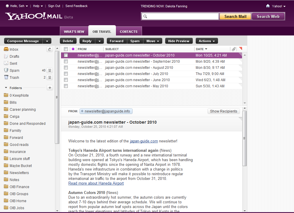
Yahoo! Mail just launched a beta for their latest user interface, which looks like the screenshot above. I have to say that I kind of liked the new skin but the heading just looks awful in my opinion: it’s too large, too loud and, honestly, pretty useless. With such a loud purple and a lot of whitespace, they are a complete distraction and annoyance when I’m reading emails.
So I took matters in my own hands and made some restyling tweaks to really make the heading compact, and the result were way better than what Yahoo does (in my own biased opinion :-)):

I took away the Beta badge, latest trending topic, the button to Yahoo’s homepage and the Search Web button as they didn’t really serve any utility to me and I even took away the ad panel to the right. My guess that all the stuff I took away would really make Yahoo screaming blasphemy :-p.
Anyway, you can download the my Stylish stylesheet override from UserScripts.org. Give it a run if you like what you see :-).
Written by
Seh Hui Leong
Python programmer by trade, interested in a broad range of creative fields: illustrating, game design, writing, choreography and most recently building physical things. Described by a friend as a modern renaissance man.