A Fresh New Look
It’s been a while I haven’t posted here :D! With my recent announcement over my LiveJournal that this will be my new permanent spot for my personal journal. And sort of adding that personal touch, I finally got around and creating a fresh look for it.
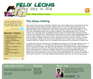
And lo and behold, the new look is already up and running - though at the time of writing (27 June 2009) Internet Explorer users may end up seeing a less optimal site, since I haven’t got around fixing the theme yet (looking forward to making it work this weekend though).

Developing this theme has been quite a feat to me, which I style it with pure CSS with minimal cruft and I also experimented with CSS3 text-shadows (to view the full effect, do use Firefox 3.5, Google Chrome or Safari 4). And I made very sure that the theme will fall back quite nicely for older browsers, which I plan to achieve with my weekend work on improving this.
Conceptually, this theme really reflects who I am in many ways. I really striven for a simplistic look but would give an impression of fullness and richness through the use of colours. I opted for a more hand-drawn look for this one, which I go as far as finding hand-drawn icons that matches with the theme (luckily I stumbled on a feature of icons in Smashing Magazine, that’s where I came to find all the cute hand-drawn icons of social networking sites). And I’m quite happy with the first vector cartoon that I had came up with for the logo - it’s pretty much me in essense, really (for the most part I’m quite a geek myself :p).
The hardest part would definitely be the colour scheme: laying out the base colours are quite trivial, but trying to paint my “canvas” and blend it with other colours with different contrast and utilizing the correct shades of colour was really hard. I mean, doing typography and layout is much easier without needing much guesswork. Personally feel that the link colours for the sidebar may need some work… feeling that it doesn’t have enough contrast to make the text more legiable. If you have come up with a better colour scheme for the sidebar, do let me know :).
Anyway, giving credit where credit is due, my heartfelt thanks to the following who are kind enough to contribute stuff with a Creative Commons license, making it freely accessible to novice web designers like myself:
- Plaintxt.org Sandbox Wordpress theme, which I used as the based in developing the theme
- TheG-Force, for the large RSS image and Twitter logo on the sidebar
- Janko’s Handycons 2, which I used as the small contact iconbar at the footer of the page
- led24.de, for the miscellaneous icons used
Really looking forward to start my journal anew and hopefully I’d be able to share more of my insights and thoughts as I experience more in life.
Written by
Seh Hui Leong
Python programmer by trade, interested in a broad range of creative fields: illustrating, game design, writing, choreography and most recently building physical things. Described by a friend as a modern renaissance man.